
Dalian Pro Academy
Dalian Pro wanted to revamp the image and brand of their World-Class Youth Academy. To ensure the new facilities reflect the elite level of the program, I created a concept identity for the club to envision how this could elevate their image to the world. This is not the final output as the project is still ongoing (pandemic delays). This concept was created to visualize the approach and final product.
Client
Dalian Pro
Service
Brand Identity
Date
2019
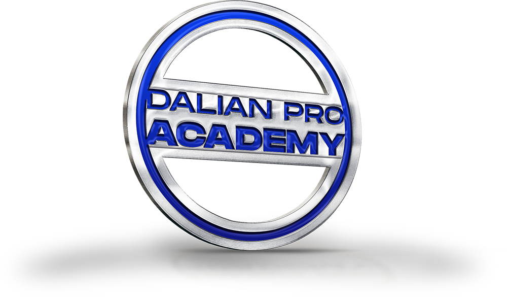
WORDMARK
The club had recently revamped their crest, so that asset could not be changed. We suggested that a wordmark to accompany the logo would help in distinguishing the academy from the first team. The approach here is to create an identity for the youth players by incorporating a visual language that speaks to the youth.

Brand Patterns
In order for the brand identity to be scalable, it’s important that the secondary assets are bold, and flexible. This will allow the design system to be implemented on any application that is needed while allowing for a distinction across divisions.


Social Media
The flexibility and clarity of the academy’s visual language must be present on social media to create a consistent and distinguishable campaign that will engage the targeted audience.

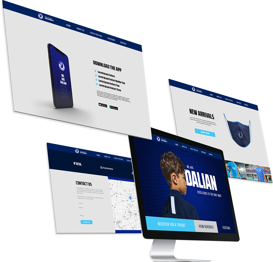
Academy Website
A modern, functional, and responsive website is central to growing the brand and is a key touchpoint for all stakeholders. The design system will be implemented to ensure this digital touchpoint is up to the standards the academy deserves.
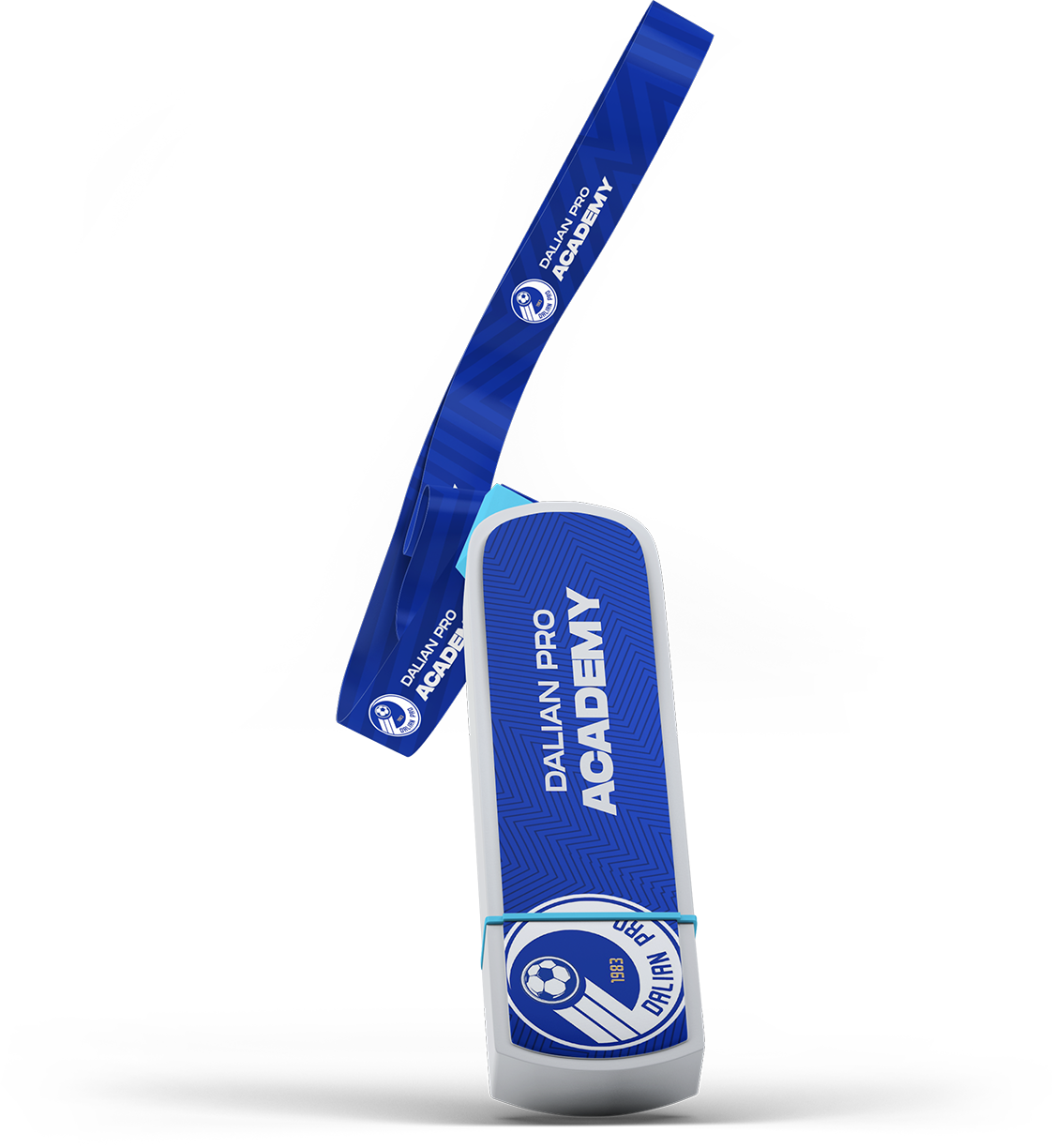
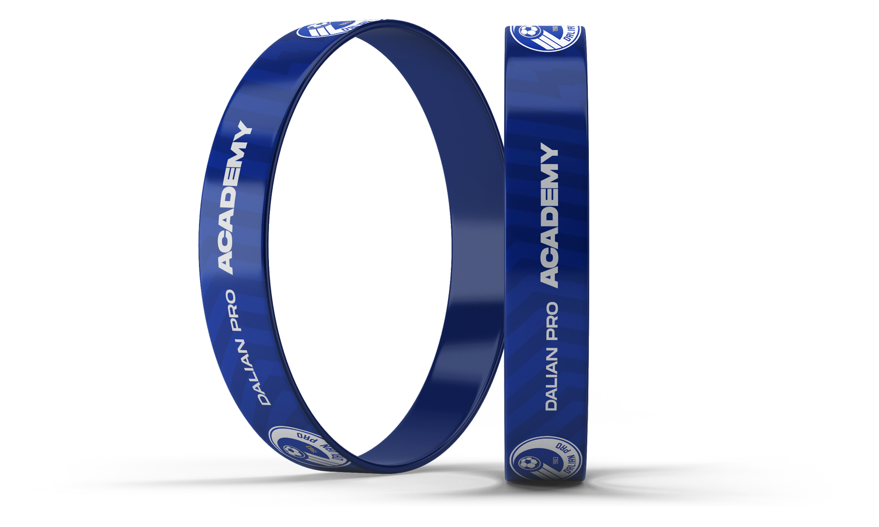
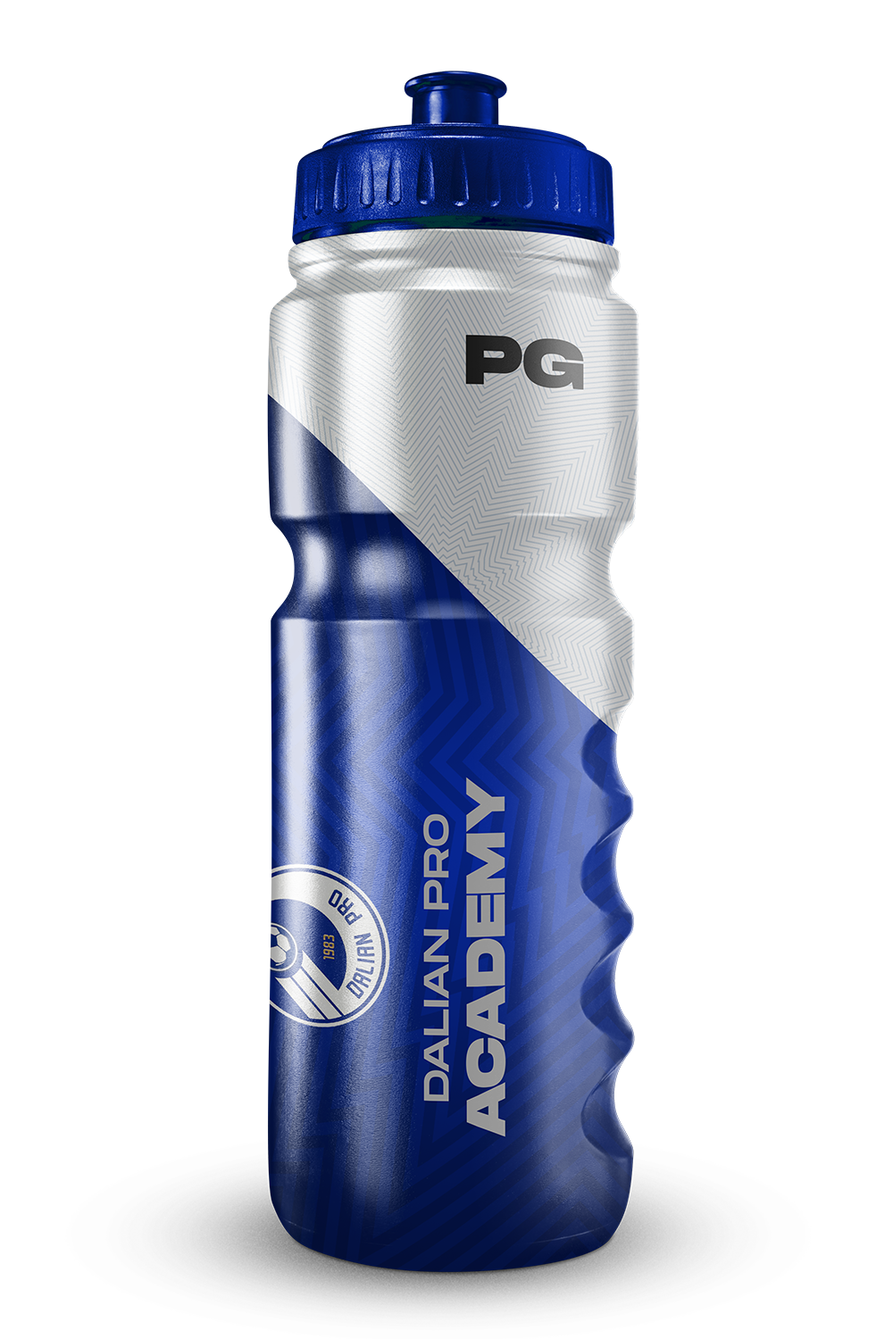
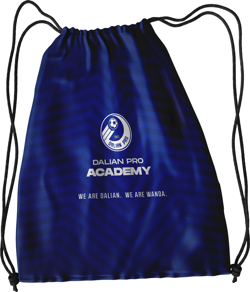
Merchandise
Designed for both staff and players, it gives the teams a sense of importance while also generating brand awareness off the field.
Event Branding
From branded flags to custom tents, field material can be useful for giving a branded feel when hosting special events such as tournaments and tryouts.


Corporate Assets
Whether its sending invitation letters to clubs, players, or sponsors, it’s important to remain well branded in such an important touch point. The visual identity of the academy is flexible enough to fit into various corporate applications such as notebooks, brochures, and presentations.


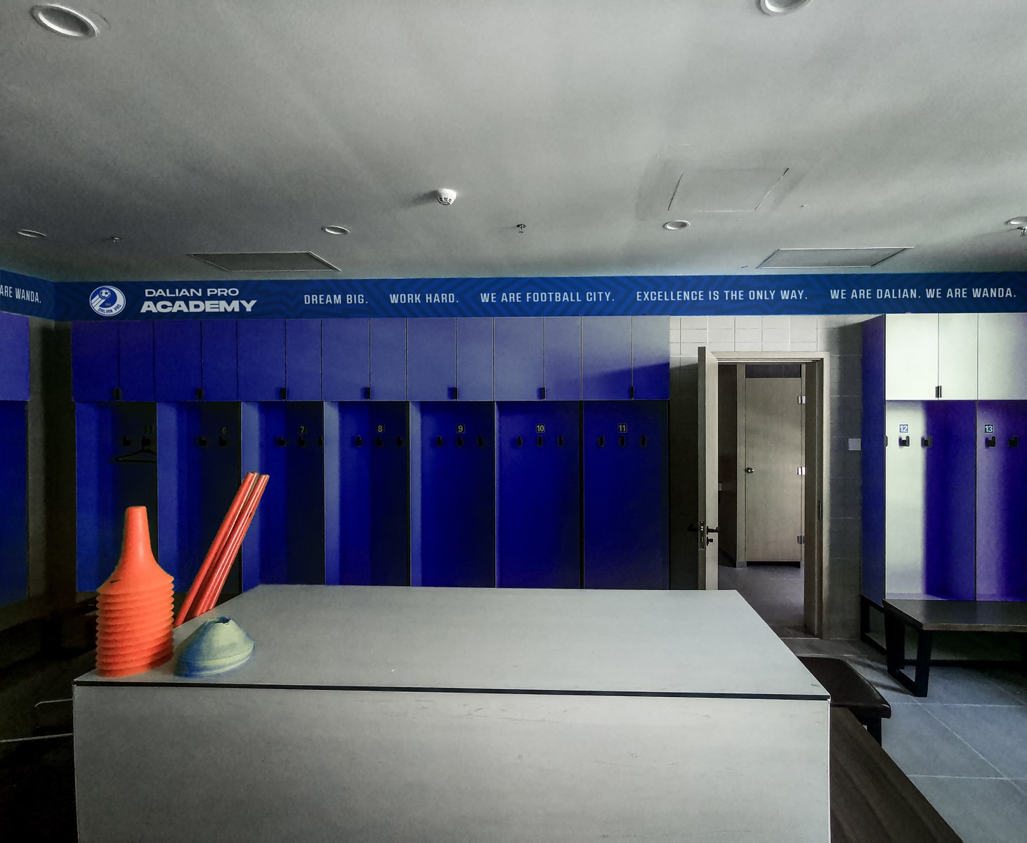
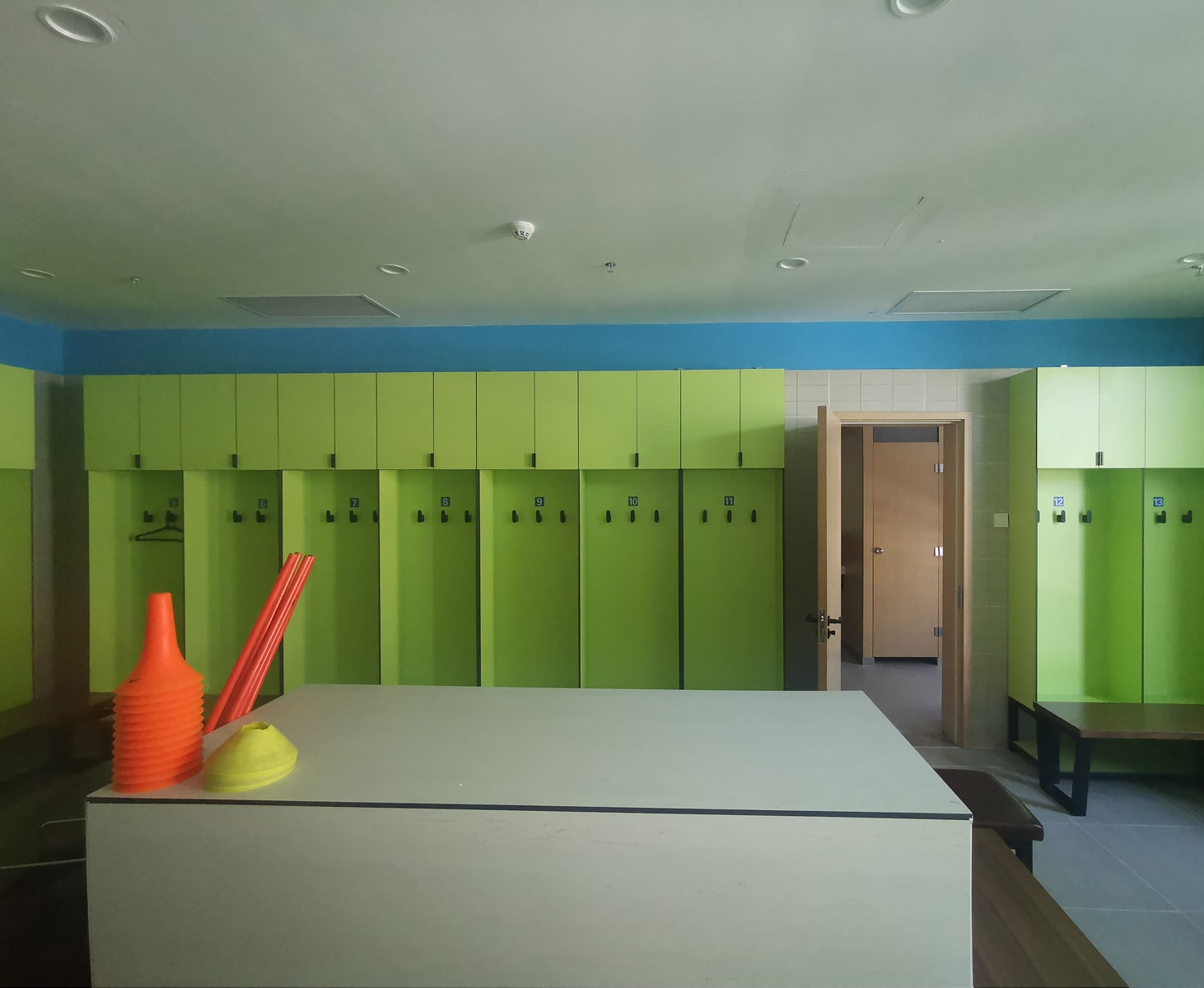
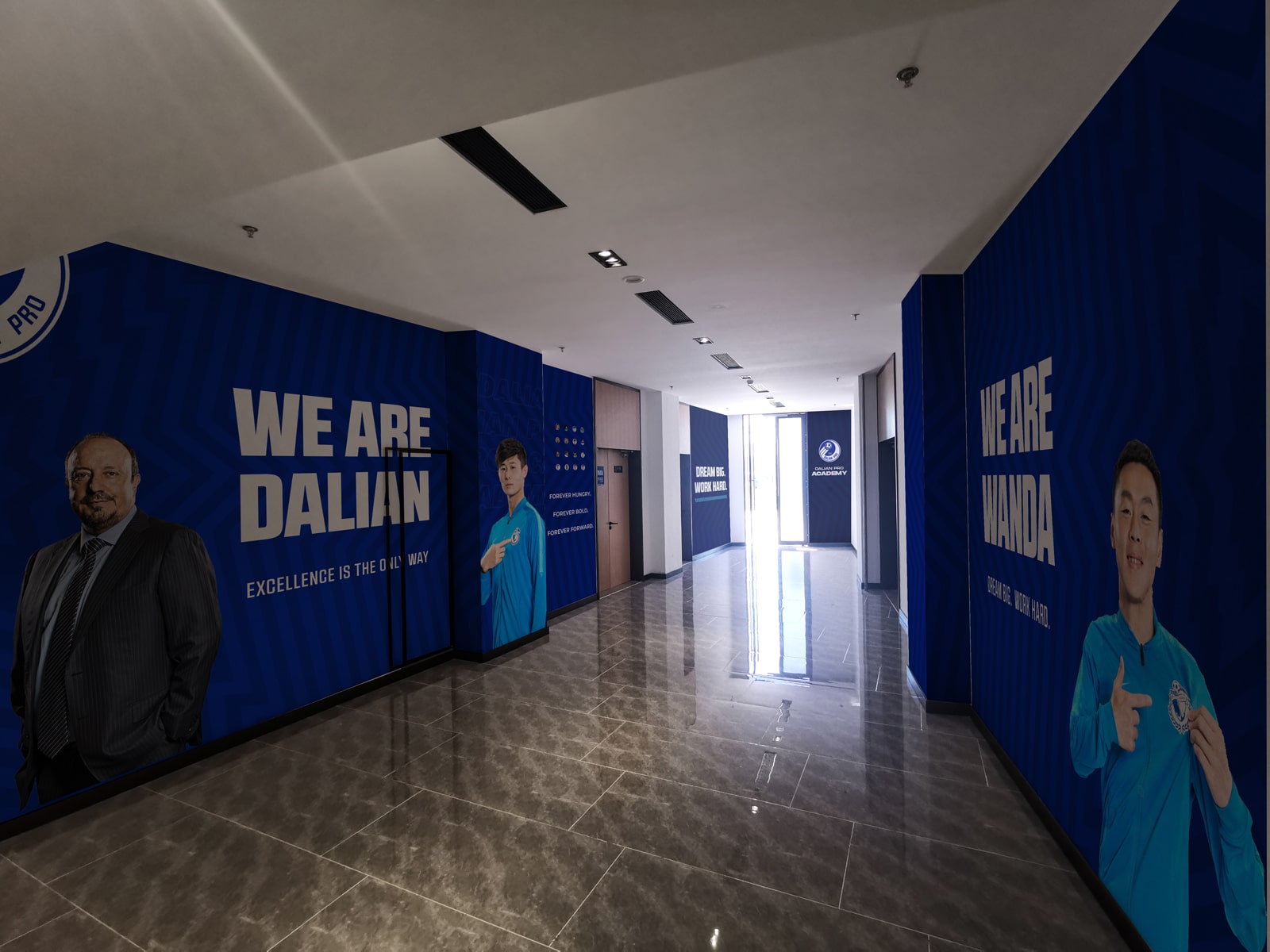
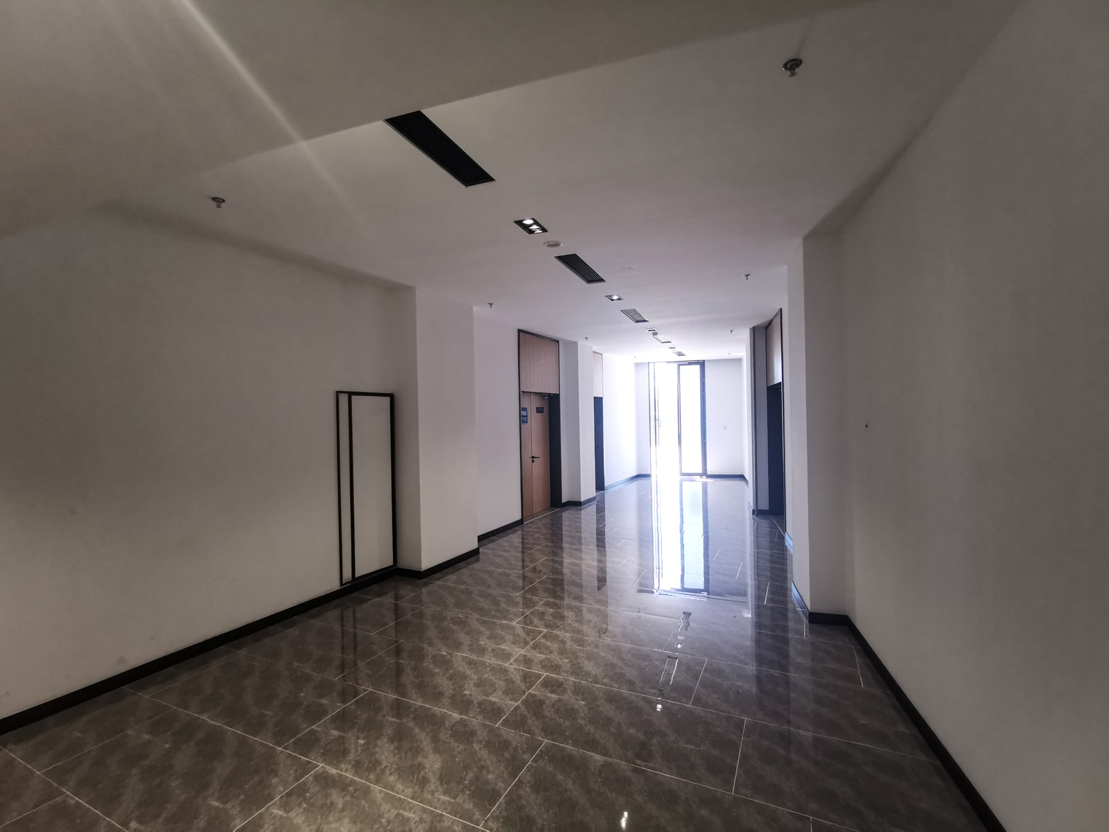
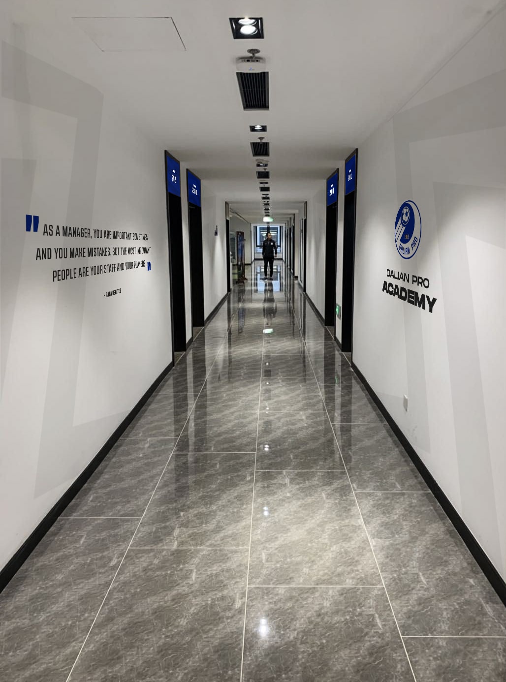
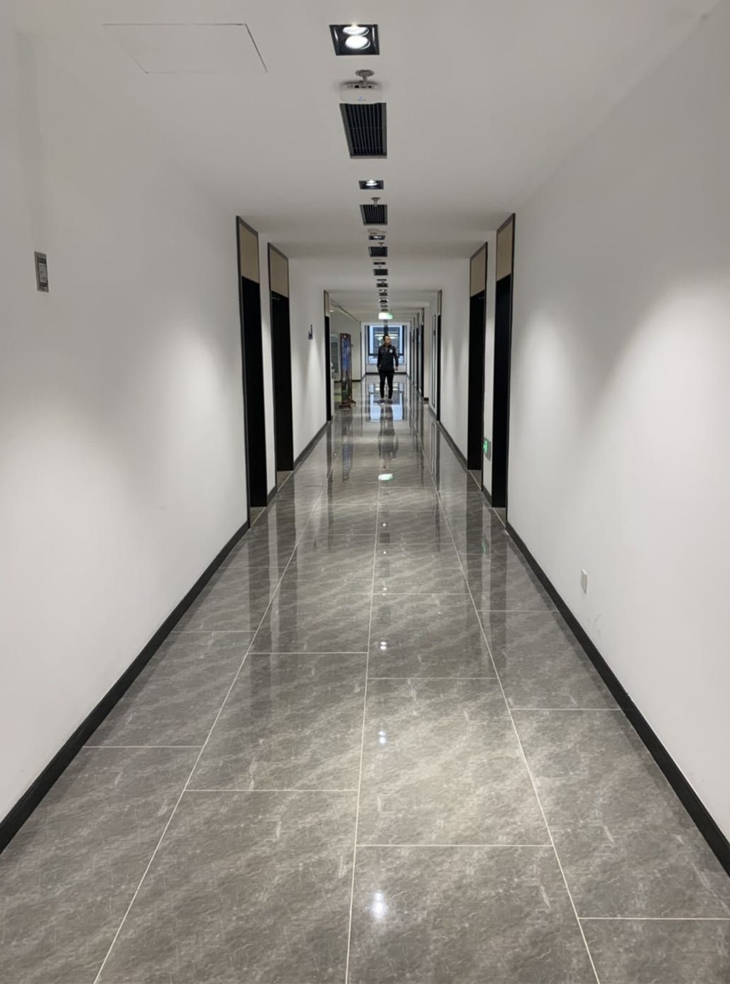
facility
branding
The club had recently built brand new state-of-the-art facilities for the youth academy. In an effort to bring the brand alive, they wanted to brand the facility and really bring the new project to life. Below you can see the before and after proposals that were approved.

.jpg)