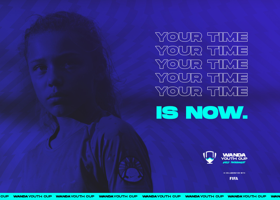
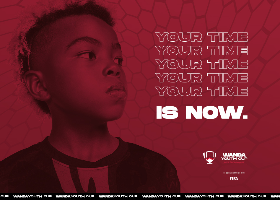
Wanda Youth Cup
Wanda reached out to develop a youth football tournament in the hopes of engaging the grassroots and elite youth football players in Dalian. I was tasked with developing a brand identity for the tournament that was flexible and engaging. The approach here was to merge the visual languages of sports and streetwear to create a visual identity that was tailored to the players. I wanted the players to be proud of attending the tournament and feel identified with the brand. While the visual identity and strategy were approved, due to COVID this project is still on hold and remains in its conceptual phase.
Client
Wanda
Service
Brand, Strategy, Campaign, Concept
Date
2019
The client wanted to develop a new way to present their sales properties to potential clients in an accesible, presentable, and modern way. Previously, the 'factsheets' were the main promotional material for the different properties. These were PDF documents that contained the key facts for each property being sold.
2019
Brand
Strategy
Concept
Campaign
Trophy Icon
I developing a trophy symbol that was flexible and scalable. We incorporated the W for Wanda that would eventually become a brand asset on its own and could serve to differentiate the different sub-brands.


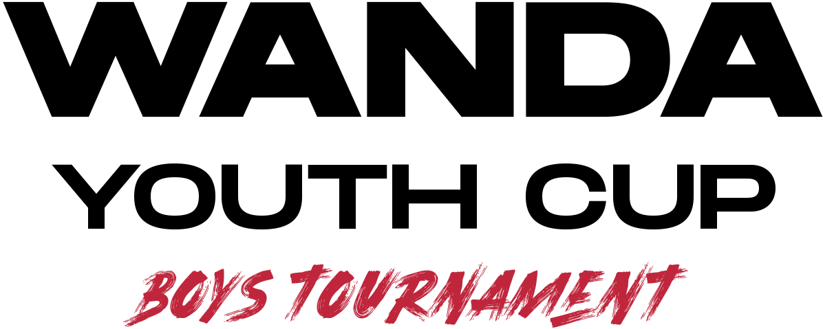
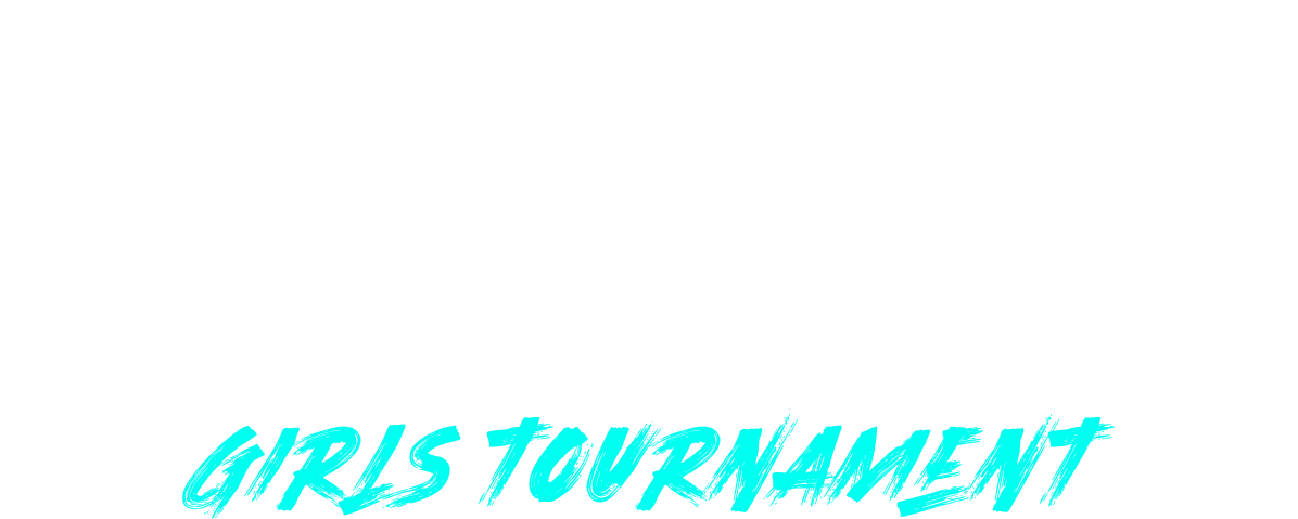
GIRLS
BOYS


WORDMARK
Since this initiative was from Wanda, we wanted to give them clear visibility in the hierarchy of the mark. The modern fonts inspired from the streetwear visual language give it a young and edgy voice that remains aligned with the brief.
GIRLS
BOYS


GIRLS
BOYS
GIRLS
BOYS


GIRLS
BOYS


GIRLS
BOYS
